TV Expansion
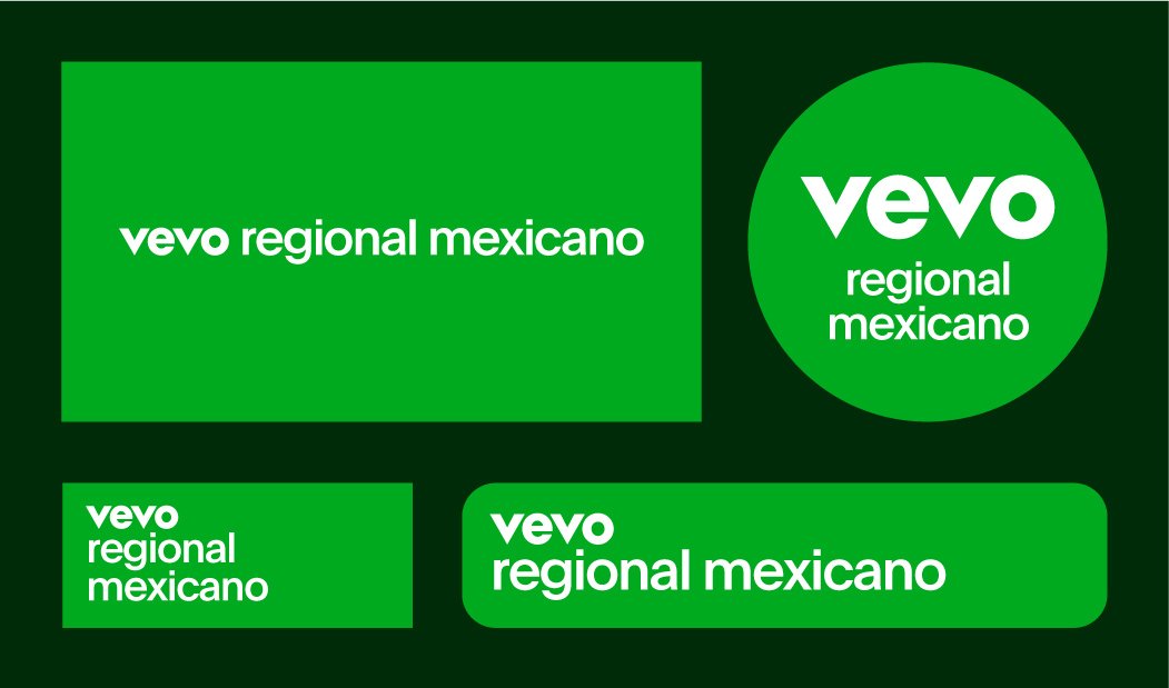
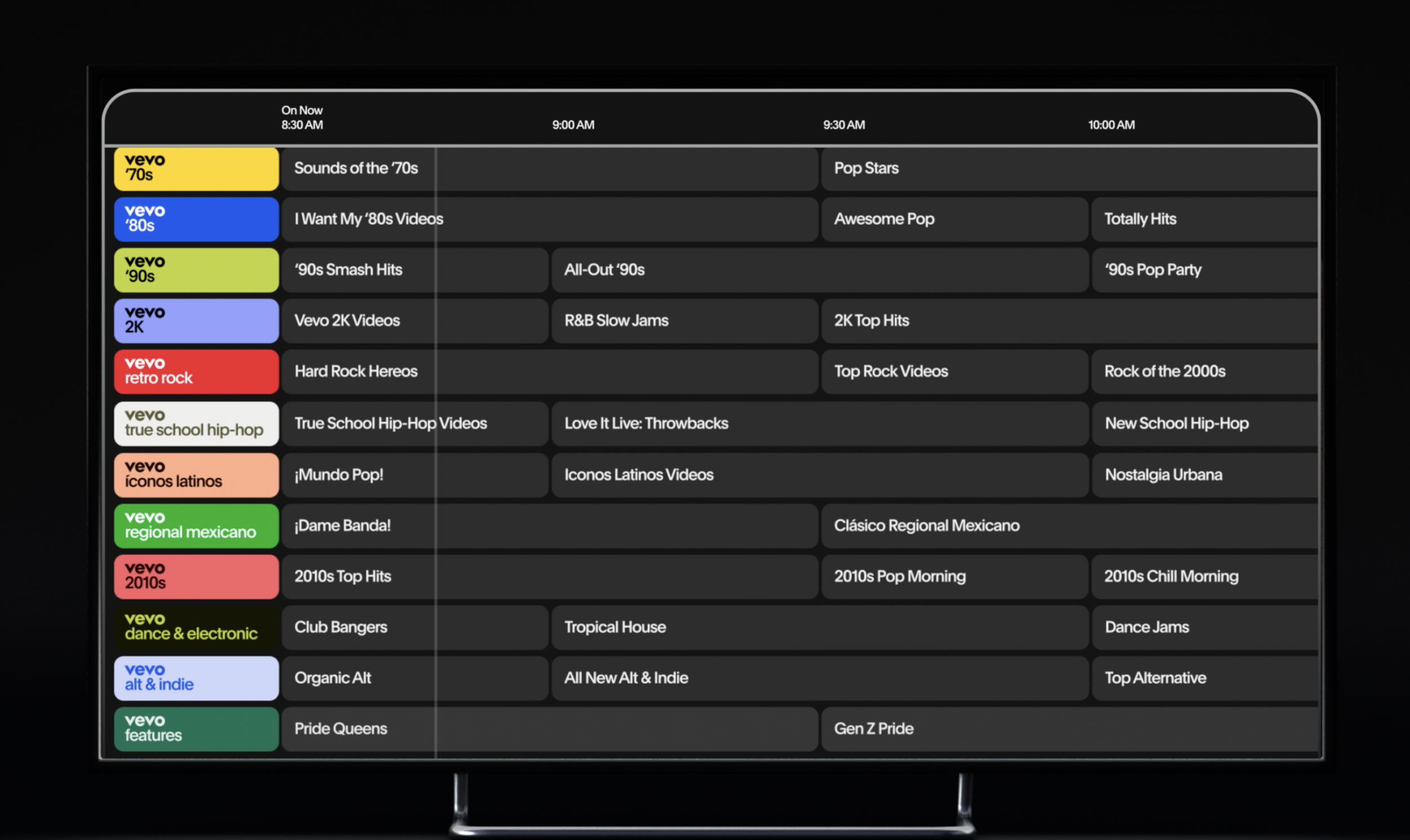
Working with so many channels across 35+ partners I had to expand the brand system a little fit all the different platforms they will appear on while remaining as accessible as possible. The design for each channel to feel consistent when seen together but with a variety of layouts to fit our partners wherever they are seen.
Connected TV Video
As the TV network continued to grow I had to build out a suite of motion templates that could be varied, beautiful, work with our 40+ partners, but could be done with rapid pace by a small team of editors. Utilizing the motion system developed in the rebrand myself and collaborator Justin Brown developed an incredible system of templates covering a myriad of outputs.
Physical Spaces
Working on our physical spaces I want the color system to shine through but not overwhelm so using black and white as core brand ‘firebreaks’ between color zones we can have offices that feel vibrant and fun but not too messy and uncomfortable to work within.


